

Andrew Pollack's Blog
Technology, Family, Entertainment, Politics, and Random Noise| Professional Services | Second Signal | Presentations | Andrew's Blog | Support |
What should the Notes desktop really look like?
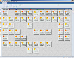
By Andrew Pollack on 05/08/2008 at 01:41 PM EDTAre you still using the same desktop workspace in Notes that you were 10 years ago? Truth be told, it is a desktop paradigm that even looks ugly when compared to the Mac Finder interface in 1991. Although there have been attempts at a replacement, most of us still use this dog of a UI with 32x32 pixel 16 color icons set into square blocks about 3 times that size. We can organize these application icons any way we like - as long as we like gray on gray in a grid pattern. We can even have folder tabs to group our little squares into families.
Why do we keep using this? Because the alternatives have been worse. Instead of focusing on what desktop users want out of an interface, IBM has for years combined mistaken approaches together into a huge waste of opportunity.
They've listened to I.T. managers who want to control every aspect of the user's desktop, putting links to everything from Human Resources intranets to cafeteria menus right up front. Whatever the company wants you to see should be right there on your desk. What? That's not what you want?
They've listened to industry "experts" who cry the virtues of dashboards and portals that keep such critical things as the company stock price close at hand at all times. What? You're not responsible for anything that impacts your company's stock price on a minute-by-minute basis? Surely you must be if it needs to be right in front of you all day.
Worst of all, they've listened to their own product managers who want to use the desktop as the proving ground for showing you that their pet expensive product is everything you ever wanted and you'd agree if only they stuck it in your face all day until you agreed. This is the "Portal" desktop approach. I'm sure there are a few percent of Lotus end users who want to look at a portal interface all day in the their Notes clients. Most don't. I'm going to write another editorial about the "Portalization" of the Notes client soon -- until then remember that I coined the phrase "Notes Liberation Front"
If users want a giant clock on the screen, they have thousands to pick from already. Users want a place to organize the things they need to get to. In the modern "Graphical" world we use "Shortcuts" and "Bookmarks" for this purpose, and often these are visually tagged with "Icons". Here is a short list of desktop folder organization schemes that user's actually like, all of which are more modern and functional than the Lotus Notes Workspace: Apple OSX, Apple OS9 (OS8, OS7, OS6,...), Windows Vista Explorer, Windows XP Explorer, Windows 2000 Explorer, Windows NT Explorer, Windows ME Explorer, Windows 98 Explorer, Windows 95 Explorer, Windows for Workgroups Explorer, Windows 3.1 Explorer, Windows 386 Explorer, Palm OS, Firefox, Outlook Express, KDE, Gnome. Should I go on?
But there's already a "Bookmarks" option in Notes. Great. Do you like it in comparison with virtually ANY of those I listed above? Here's a challenge. Instead of listening to these so-called experts, go look at what they're using. Don't just look at their Notes clients. Go look at how their OS desktops are organized. In Notes 8 we get the "Open List" which is a step forward I suppose, but to quote Yoda "Break me a fscking give!" It works just like Windows 95.
People, this is a problem that's been solved already.
What should the Notes bookmark interface look like?
It should look like your operating system's folder system. Folders should be stackable, resizable, MDI containers, each with the own pull down menu for dealing with the various folder activites. The objects inside should be viewable in a list, as icons, or with details. In a details or list view they should be sortable by column heading. In an icon view they should stay wherever you put them. If you want them to snap to a grid it should be YOUR choice. You should be able to create shortcuts or links to objects so that they can be in more than one folder. Icons themselves should be compatible with either .ICO files or as GIF, JPG, and PNG files themselves.
What should the Notes client desktop look like? Nothing. There needn't be one. The bookmarks interface should be an extension of the operating system folders. Your mail file looks like anything else in that folder system. Your database icons get to mix and play nicely with all the other tools you have on your computer. If you're working on a Notes document, it gets a window with tool bars that are appropriate to whatever editor or viewer you're using. The side bars become operating system side bars -- or they stay rooted in a system tray icon (or whatever docking system is used by your operating system of choice).
Get rid of the massive container UI completely. It serves no purpose other than to corral things that you don't use together anyway. You don't need your forum posts rounded up into the same container as your mail documents, do you? My operating system has excellent facilities built in that let me manage having multiple activities going on at the same time. If I don't like the ones that come with my operating system, there are dozens or even hundreds of add on window managers.
What do you think? Am I wrong here? What is so important about the Notes "Desktop" container anyway?
What if the notes client just disappeared into the underlying OS? Yes, lots to
think about here.
in. Log in once and thats it...now that would be interesting.. the most minimal
of minimal UI's
Now that has set me wondering.. where is me pencil....
And you all know that the design of the "new" workspace (he one that did not
get implemented for Notes 8) was basically this design that Andrew mentions.
So the thought and the desier are there. We just have to execute.
I'm still using the workspace after 12 years with Notes. It's still how I get
stuff done, the attempts at killing it with the terrible implementations of
bookmarks just havent really cut it.
The workspace both sucks, and is great at the same time. We all know the
reasons. I have made the effort to use the default homepage now in Notes8 but
besides mail, the first application I open is still, the workspace...
Some of the user interfaces I've really liked that could provide some
inspiration as a way to improve the way we interact with Notes apps are:
Opera's Speed Dial and the clones such as the excellent Fast Dial add-on for
Firefox, or iPhone/iTunes.
Alternatives to the workspace in Notes have been the menu bookmarking systems
which havent really improved much of anything IMO. IBM should give your
approach a try. If I'm using a Windows desktop and needed to access a specific
Notes app, I think it would be cool if I could click Start, All Programs,
Lotus, My Super Cool App and *poof*! it opens.
across multiple organisations, I'm in a situation most users aren't going to be
anywhere near, but it's the easiest way of finding stuff that I've encountered.
I just had a quick count, and spread between 16 tabs, I have around 800 db
icons, with stacked replicas switched on, all organised where I want them. The
only sidebar icon's I ever use are the Home icon to get me to the workspace
after a location & ID switch has dumped me out on the default home page, or the
Applications, Workspace icon (right-click, Set as Homepage, Replace Workspace
with Workspace as home page - Y/N?) whenever my client forgets where it should
be.
I don't hink I could do my job remotely as efficiently without it.
Developer an Poweruser I use the notes Desktop every day.
Maybe it is ugly, but it a clean way to organize your databases with different
servers. The local tile for a Template can be placed next to a Tile for a
Test-DB on Server One, next to a Tile for a Prod-DB on our main Server.
Replicas are stacked, you can see all Server on one tile and with a click you
cann acces much more information about your database.
An Explorer alike Tree-View wouldn't help. That's what we get with Domino
Administrator: Seeing only one Server, but hundrets of databases.
Plain Jane may stick with Bookmarks, I need the Notes Desktop.
general, preferences will vary. What is interesting, though, that with the
externsions available in Notes 8 you can write your own desktop and make it
look like anything you want. Granted, you probably can't make it "disappear
into the OS" with just the extensions. But if you want to retain the client,
you can use any visual metaphor you want.
millions of users - the Notes Workspace is what is on their screen all day. If
they need to work on an office document - they most likely double-clicked on it
from an eMail. If they need to surf the web, they may have double-clicked a
link from an eMail. And these millions of users get lost, easily, when things
get moved around too much.
I've seen users in Explorer drag a file by accident and drop it while stilll
moving the mouse around and poof - it's gone from their perspective [sure you
can search for it, move it back, and wiggle your finger at them].
Whatever the next generation idea is, make it an option, so the millions with
the comfort of the workspace can still be supported easily.
Good thread we have going here!
Other Recent Stories...
- 27-08-2025Updated Quick Reference to Create SSL/TLS Certificates manually for CertStoreIt's been a long time since I've added anything about Domino here, but I wanted to put this where I'd find it next year and though some of you might find it useful as well. There's lots of instructions out there around using "LetsEncrypt" or whatever to generate short lived SSL certificates for Domino, but if you want to use a full blown certificate authority -- or maybe your company does self signed certificates and you want to use those, here's a quick reference. Prerequisite: You should already have ......
- 01/26/2023Better Running VirtualBox or VMWARE Virtual Machines on Windows 10+ Forgive me, Reader, for I have sinned. I has been nearly 3 years since my last blog entry. The truth is, I haven't had much to say that was worthy of more than a basic social media post -- until today. For my current work, I was assigned a new laptop. It's a real powerhouse machine with 14 processor cores and 64 gigs of ram. It should be perfect for running my development environment in a virtual machine, but it wasn't. VirtualBox was barely starting, and no matter how many features I turned off, it could ......
- 04/04/2020How many Ventilators for the price of those tanks the Pentagon didn't even want?This goes WAY beyond Trump or Obama. This is decades of poor planning and poor use of funds. Certainly it should have been addressed in the Trump, Obama, Bush, Clinton, Bush, and Reagan administrations -- all of which were well aware of the implications of a pandemic. I want a military prepared to help us, not just hurt other people. As an American I expect that with the ridiculous funding of our military might, we are prepared for damn near everything. Not just killing people and breaking things, but ......
- 01/28/2020Copyright Troll Warning
- 03/26/2019Undestanding how OAUTH scopes will bring the concept of APPS to your Domino server
- 02/05/2019Toro Yard Equipment - Not really a premium brand as far as I am concerned
- 10/08/2018Will you be at the NYC Launch Event for HCL Domino v10 -- Find me!
- 09/04/2018With two big projects on hold, I suddenly find myself very available for new short and long term projects.
- 07/13/2018Who is HCL and why is it a good thing that they are now the ones behind Notes and Domino?
- 03/21/2018Domino Apps on IOS is a Game Changer. Quit holding back.
mine and the discussion was "pulled" or whatever.
this is a no brainer. you are right on the money.